css Intermediate
Flexbox equal height cards

Interactive editor — edit code and see live results
Open in Editor
Flexbox magic
<div class="cardContainer">
  <div class="card">
    <p class="cardContent">
      Card 1 with little text.
    </p>
    <button>
      I'm at the bottom
    </button>
  </div>
  <div class="card">
    <p class="cardContent">
      Card 2 with a bit more than little text.
    </p>
    <button>
      I'm at the bottom
    </button>
  </div>
  <div class="card">
    <p class=cardContent>
    Card 3 with a lot of text. By a lot I mean at least couple of lines of text. Just a bit more text to make sure.
    </p>
    <button>
      I'm at the bottom
    </button>
  </div>
</div>.cardContainer {
display: flex;
width: 100vw;
}
.card {
display: flex;
flex-direction: column;
width: 33.3%;
margin-right: 1rem;
padding: 1rem;
border-radius: 6px;
background-color: #096dd9;
color: #FFF;
}
.cardContent {
flex: 1;
}Summary
- Flexbox was used on the container div to make all child cards equal height.
- A card itself is also constructed with flexbox for column layout.
flex: 1property expands height of the card content to keep button at the bottom for all cards.
Try this in our interactive code editor
Practice hands-on with our built-in code sandbox.
Open Code Editor
Adrian Bigaj 

Creator of BigDevSoon
Full-stack developer and educator passionate about helping developers build real-world skills through hands-on projects. Creator of BigDevSoon, a vibe coding platform with 21 projects, 100 coding challenges, 40+ practice problems, and Merlin AI.
Related Pills
css Intermediate
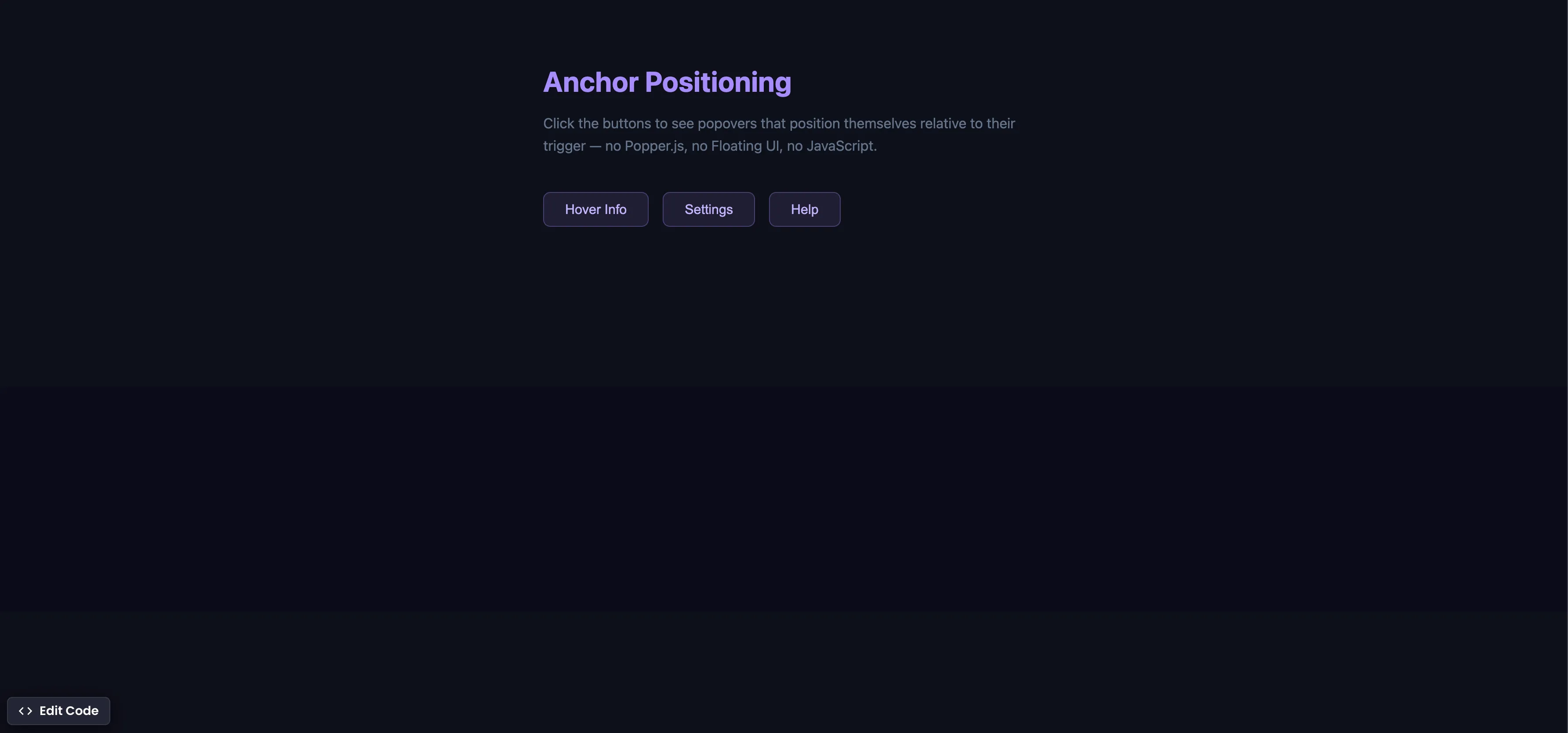
CSS Anchor Positioning
Position popovers relative to any element using CSS anchor positioning — no JavaScript positioning library needed.
css Intermediate
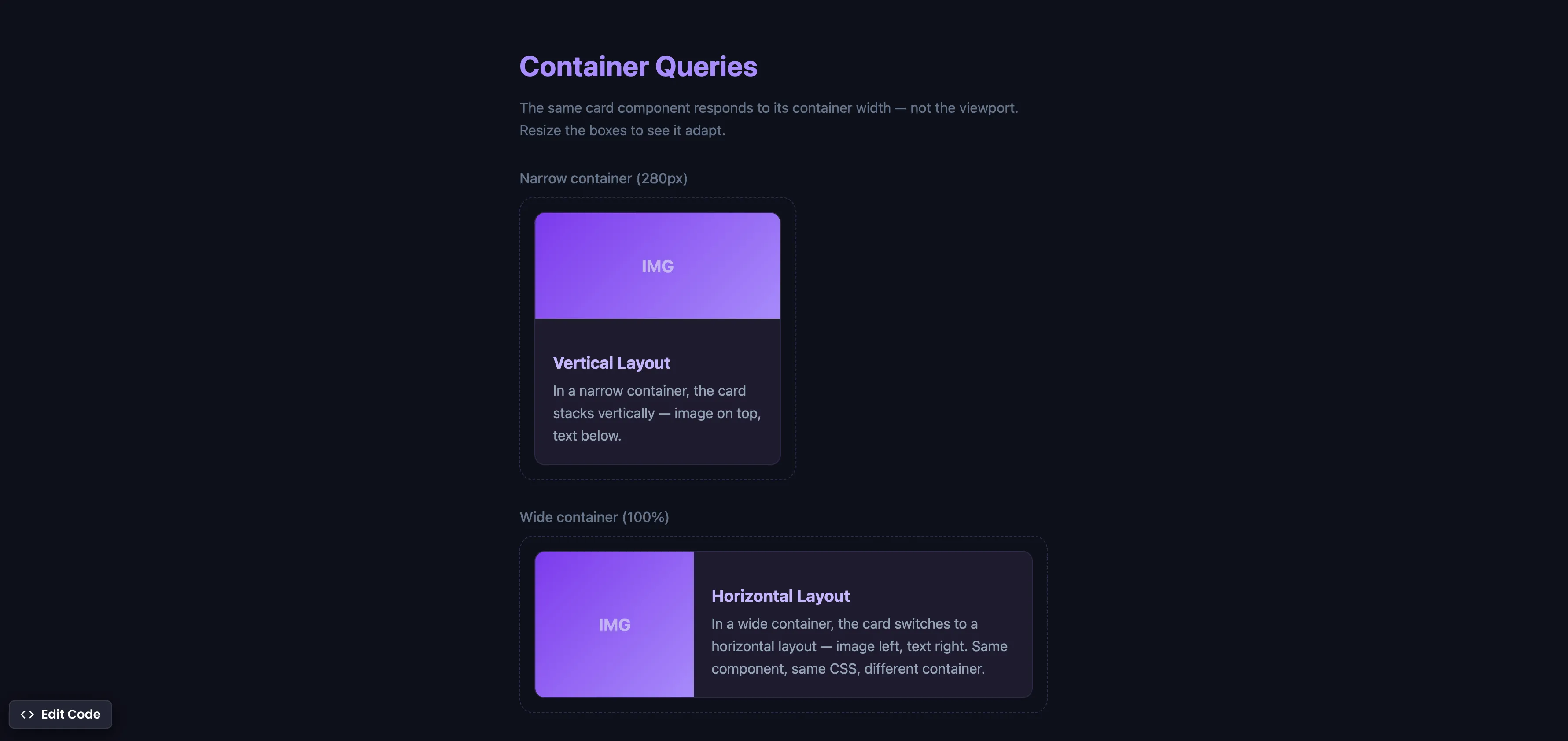
CSS Container Queries
Make components respond to their container width instead of the viewport — true component-level responsive design.
css Intermediate
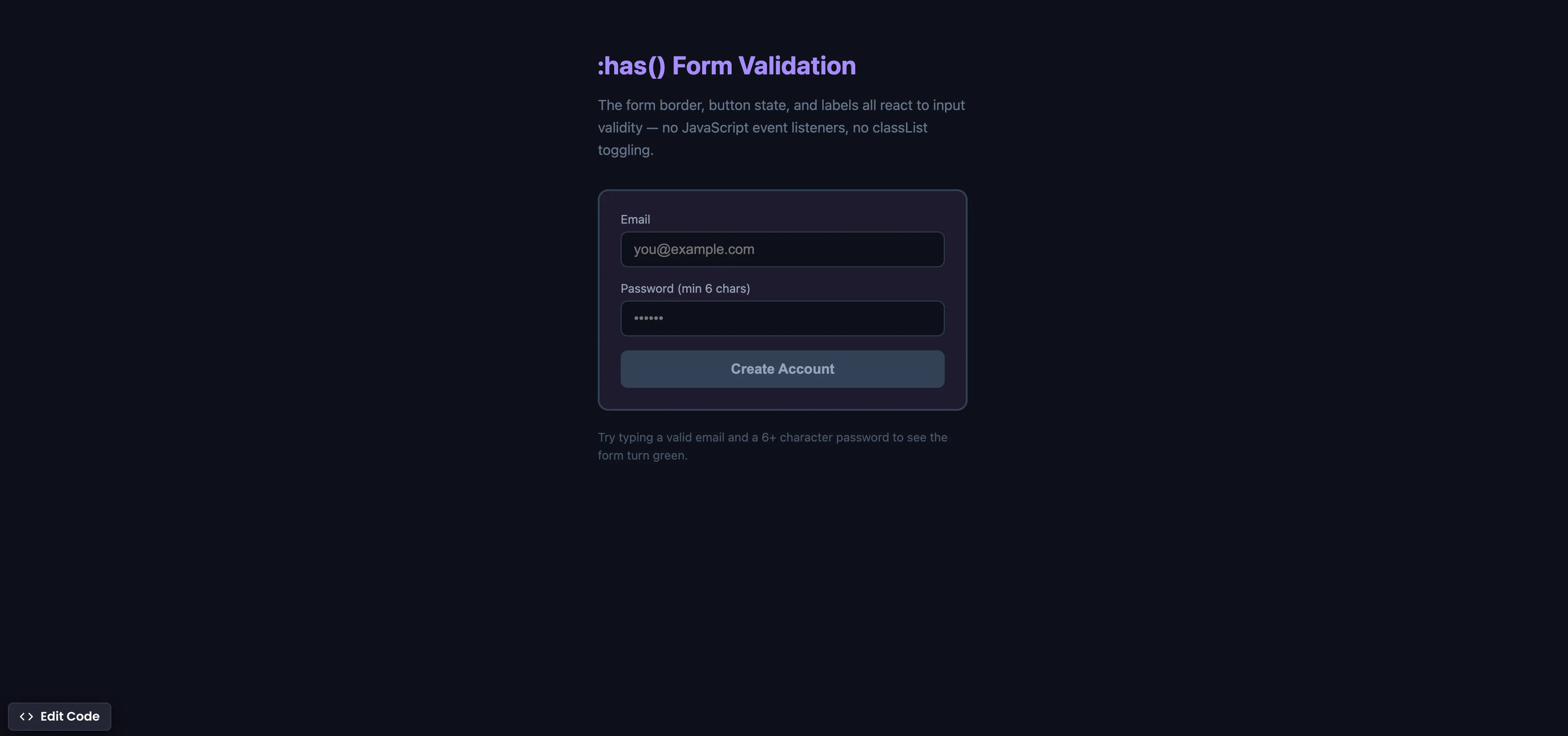
CSS :has() Form Validation
Style forms based on input validity using the :has() parent selector — no JavaScript event listeners needed.