css Intermediate
CSS Container Queries
Interactive editor — edit code and see live results
Open in Editor
How It Works
.card-wrapper {
  container-type: inline-size;
}

.card {
  display: grid;
  grid-template-rows: auto 1fr;
}

@container (min-width: 420px) {
  .card {
    grid-template-columns: 180px 1fr;
    grid-template-rows: none;
  }
}
Summary
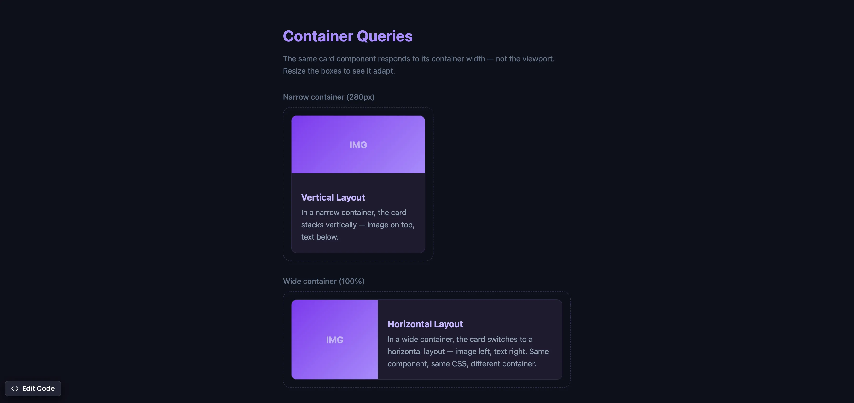
container-type: inline-sizeestablishes a containment context, telling the browser to track the container’s width for query purposes.@containerqueries work like media queries, but instead of checking the viewport width, they check the container’s width.- The same card component automatically switches from a vertical layout (narrow container) to a horizontal layout (wide container) — without any JavaScript.
- This is true component-level responsive design — something that
@mediaqueries, Tailwind, and Bootstrap cannot achieve because they only respond to viewport dimensions. - Supported in Chrome 105+ (Aug 2022), Safari 16+ (Sep 2022), Firefox 110+ (Feb 2023), and Edge 105+. Fully cross-browser.
Try this in our interactive code editor
Practice hands-on with our built-in code sandbox.
Open Code Editor
Adrian Bigaj 

Creator of BigDevSoon
Full-stack developer and educator passionate about helping developers build real-world skills through hands-on projects. Creator of BigDevSoon, a vibe coding platform with 21 projects, 100 coding challenges, 40+ practice problems, and Merlin AI.
Related Pills
css Intermediate
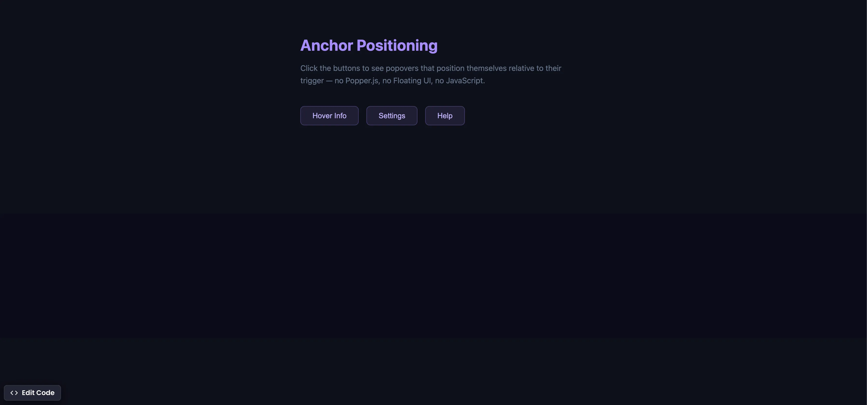
CSS Anchor Positioning
Position popovers relative to any element using CSS anchor positioning — no JavaScript positioning library needed.
css Intermediate
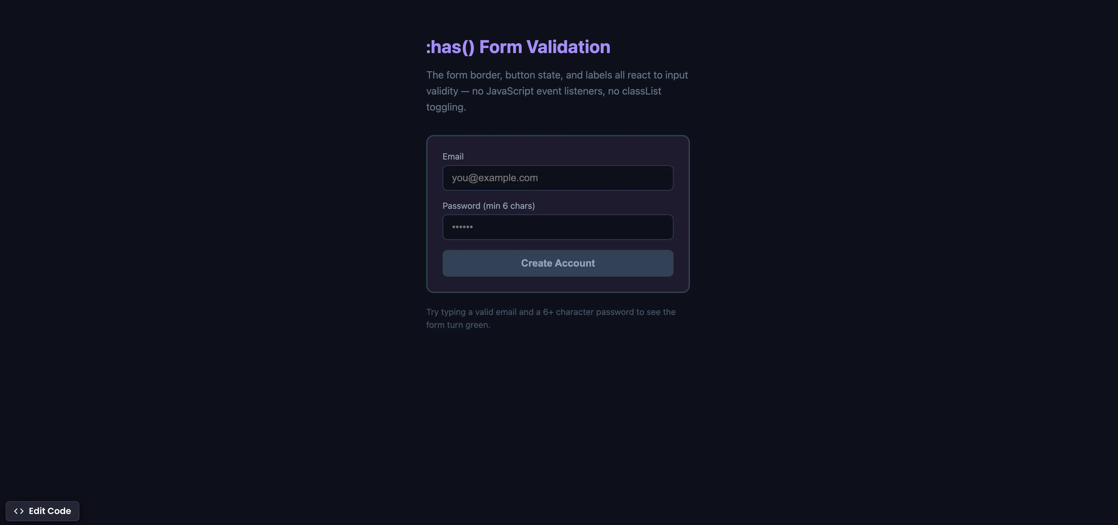
CSS :has() Form Validation
Style forms based on input validity using the :has() parent selector — no JavaScript event listeners needed.
css Intermediate
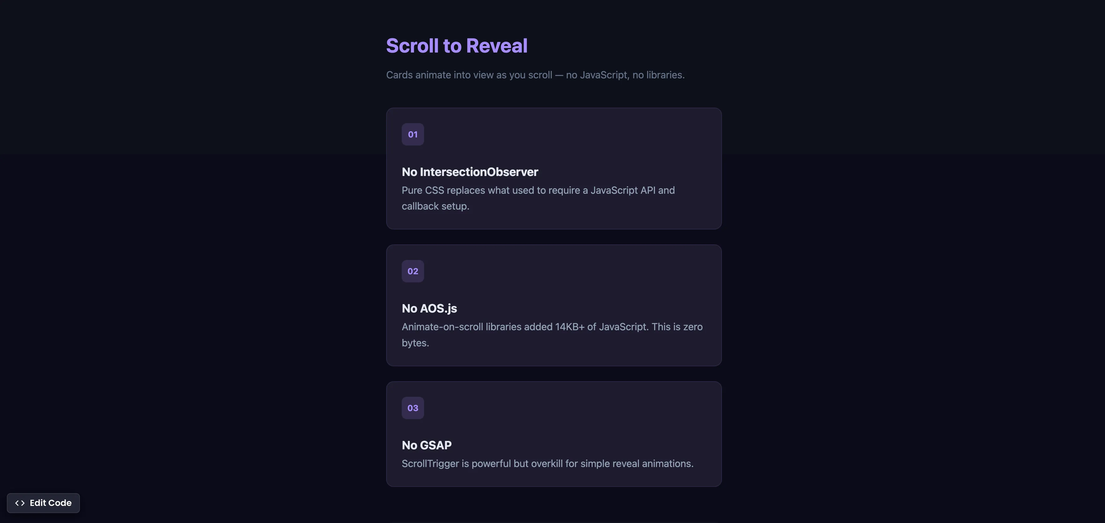
CSS Scroll Reveal Animations
Animate elements into view as they enter the viewport — no JavaScript, no libraries, just CSS.