css Intermediate
CSS Scroll Reveal Animations
Interactive editor — edit code and see live results
Open in Editor
How It Works
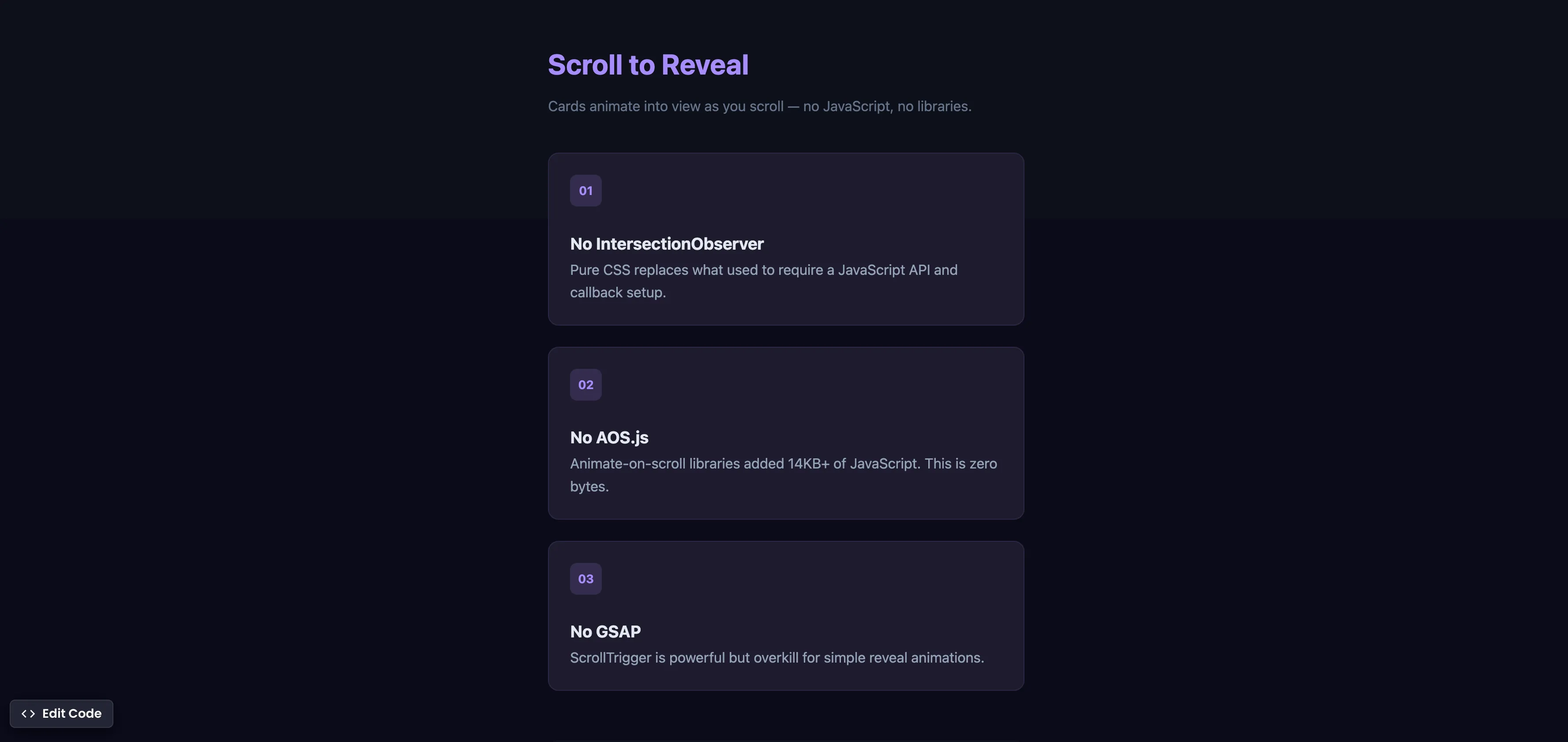
.card {
  animation: reveal linear both;
  animation-timeline: view();
  animation-range: entry 0% entry 100%;
}

@keyframes reveal {
  from {
    opacity: 0;
    transform: translateY(40px);
  }
  to {
    opacity: 1;
    transform: translateY(0);
  }
}
Summary
animation-timeline: view()triggers the animation based on when the element enters and exits the viewport, similar toIntersectionObserverbut with zero JavaScript.animation-range: entry 0% entry 100%controls the animation timing — it starts when the element begins entering the viewport and completes when it’s fully visible.- This pattern replaces libraries like AOS.js (14KB+), GSAP ScrollTrigger, or custom
IntersectionObserversetups. - The animation runs on the compositor thread, making it performant with no layout thrashing or jank.
- Supported in Chrome 115+ (Jul 2023), Edge 115+, and Safari 18+ (Sep 2024). Firefox: behind flag.
Try this in our interactive code editor
Practice hands-on with our built-in code sandbox.
Open Code Editor
Adrian Bigaj 

Creator of BigDevSoon
Full-stack developer and educator passionate about helping developers build real-world skills through hands-on projects. Creator of BigDevSoon, a vibe coding platform with 21 projects, 100 coding challenges, 40+ practice problems, and Merlin AI.
Related Pills
css Intermediate
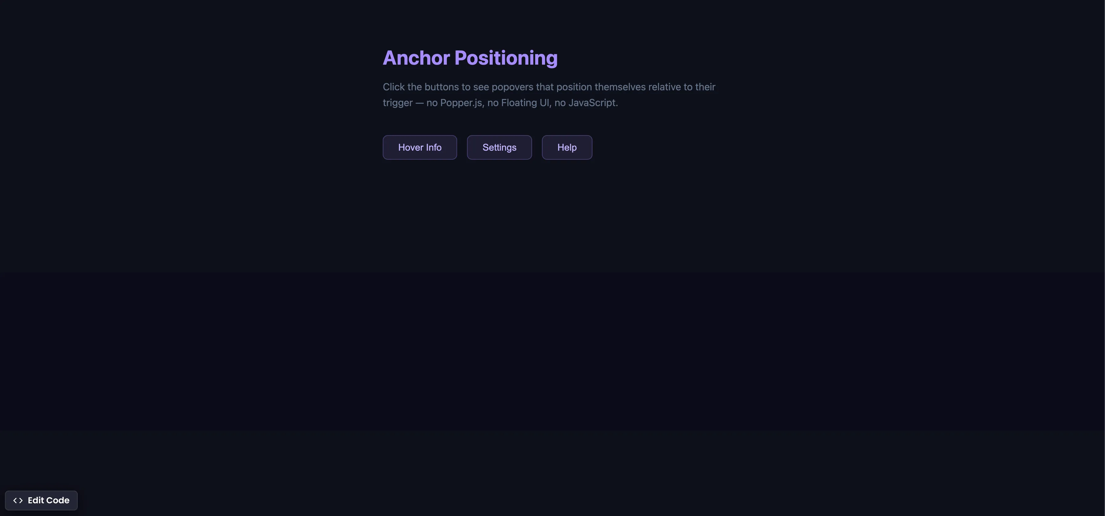
CSS Anchor Positioning
Position popovers relative to any element using CSS anchor positioning — no JavaScript positioning library needed.
css Intermediate
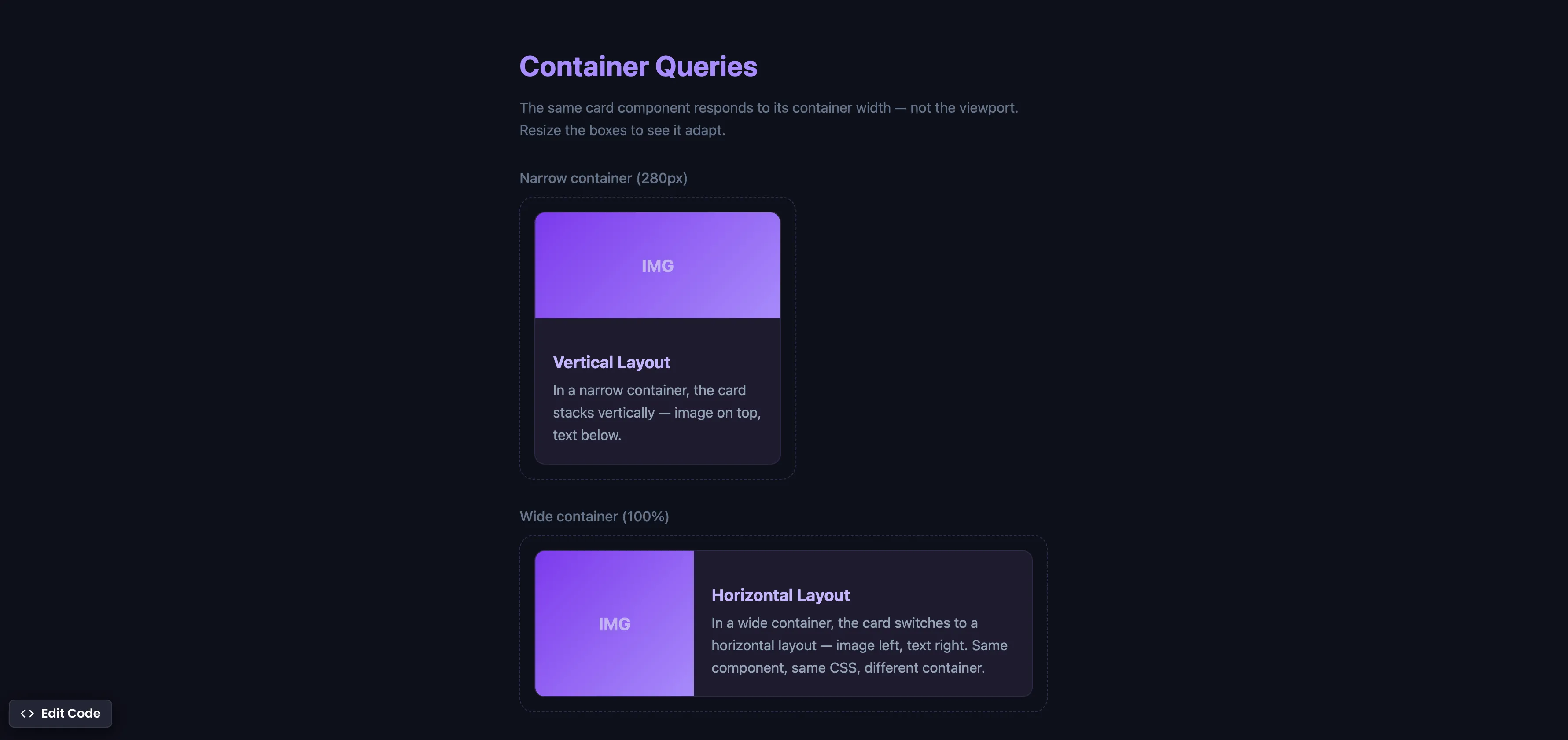
CSS Container Queries
Make components respond to their container width instead of the viewport — true component-level responsive design.
css Intermediate
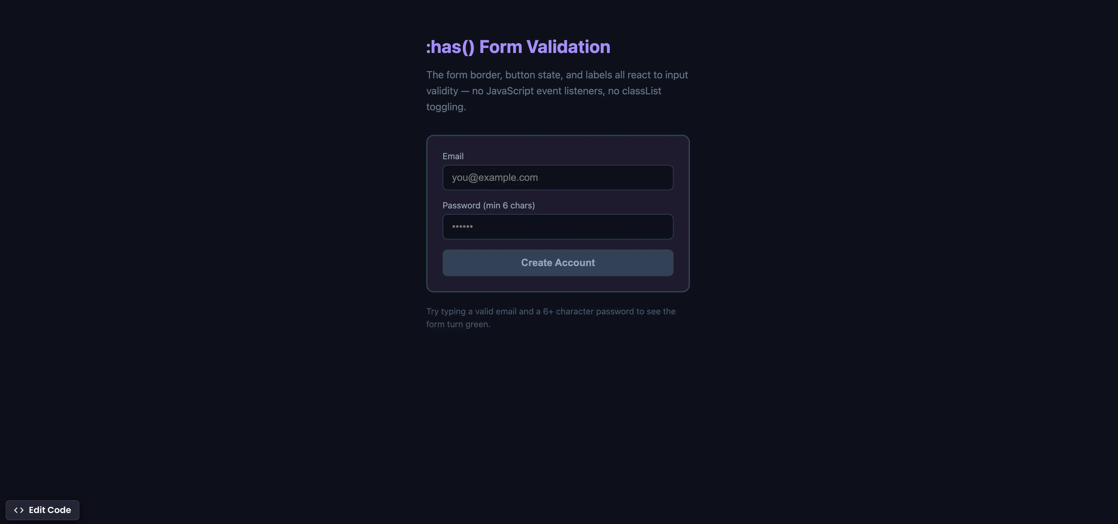
CSS :has() Form Validation
Style forms based on input validity using the :has() parent selector — no JavaScript event listeners needed.