css Intermediate
CSS Relative Units

Interactive editor — edit code and see live results
Open in Editor
Relative units
<div class="wrapper">
   <!-- em unit - 2em * 8px = 16px -->
   <div class="emUnit">
      em: I'm relative to the closest font-size, in this case div "wrapper" parent element.
   </div>
   <!-- rem unit - 2em * 12px = 24px -->
   <div class="remUnit">
      rem: I'm relative to font size of html root element.
   </div>
   <div class="flexWrapper">
      <div class="viewportUnit bordered">
         <!-- vw, vh - viewport width & viewport height -->
         vw/vh: My size is 20vw x 20vh
      </div>
      <!-- vmin - take what's smaller vw or vh -->
      <div class="viewportMinUnit bordered">
         vmin: My size is 50vmin x 20vmin
      </div>
      <!-- vmax - take what's bigger vw or vh -->
      <div class="viewportMaxUnit bordered">
         vmax: My size is 20vmax x 7vmax
      </div>
   </div>
</div>
html {
font-size: 12px;
}
.wrapper {
font-size: 8px;
text-align: center;
}
.emUnit {
font-size: 2em;
}
.remUnit {
font-size: 2rem;
}
.bordered {
border: 1px dashed black;
}
.flexWrapper {
display: flex;
align-items: center;
justify-content: center;
margin-top: 1rem;
}
.flexWrapper > div {
margin-right: 1rem;
padding-top: 1rem;
}
.viewportUnit {
width: 20vw;
height: 20vh;
}
.viewportMinUnit {
width: 50vmin;
height: 20vmin;
}
.viewportMaxUnit {
width: 20vmax;
height: 7vmax;
}Summary
- Each unit has its own use cases and best practices.
- I love using
remas it’s a scalable unit and consistent across devices (if proper media queries are set in root HTML element). Also, a lot of duplication is removed as e.g. font is changed in one place. viewportunits can be a good solution for full-page screens and other scenarios where you need to take viewport size into consideration.- Always check supported browsers on caniuse for the unit you use.
- Read more best practices about CSS units.
Try this in our interactive code editor
Practice hands-on with our built-in code sandbox.
Open Code Editor
Adrian Bigaj 

Creator of BigDevSoon
Full-stack developer and educator passionate about helping developers build real-world skills through hands-on projects. Creator of BigDevSoon, a vibe coding platform with 21 projects, 100 coding challenges, 40+ practice problems, and Merlin AI.
Related Pills
css Intermediate
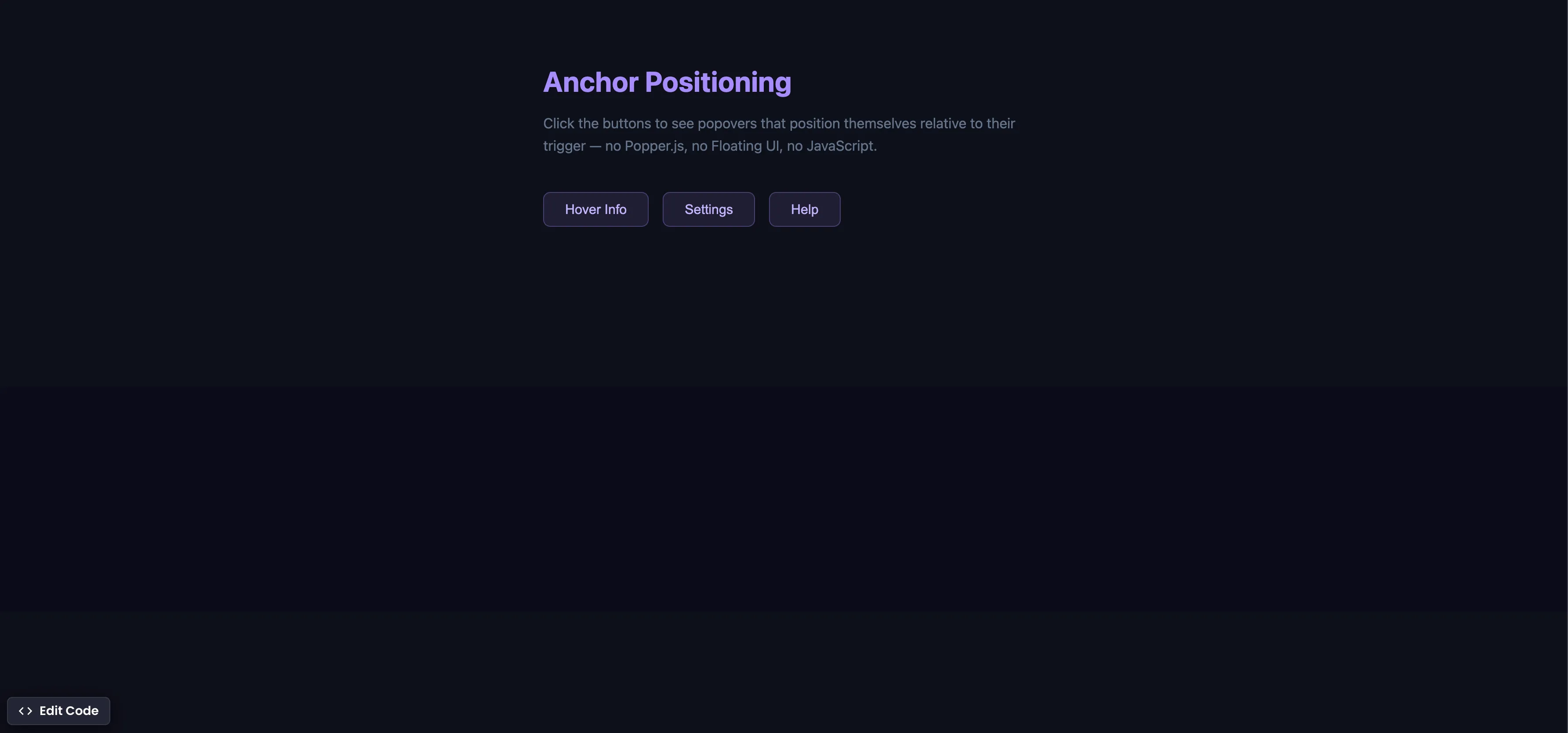
CSS Anchor Positioning
Position popovers relative to any element using CSS anchor positioning — no JavaScript positioning library needed.
css Intermediate
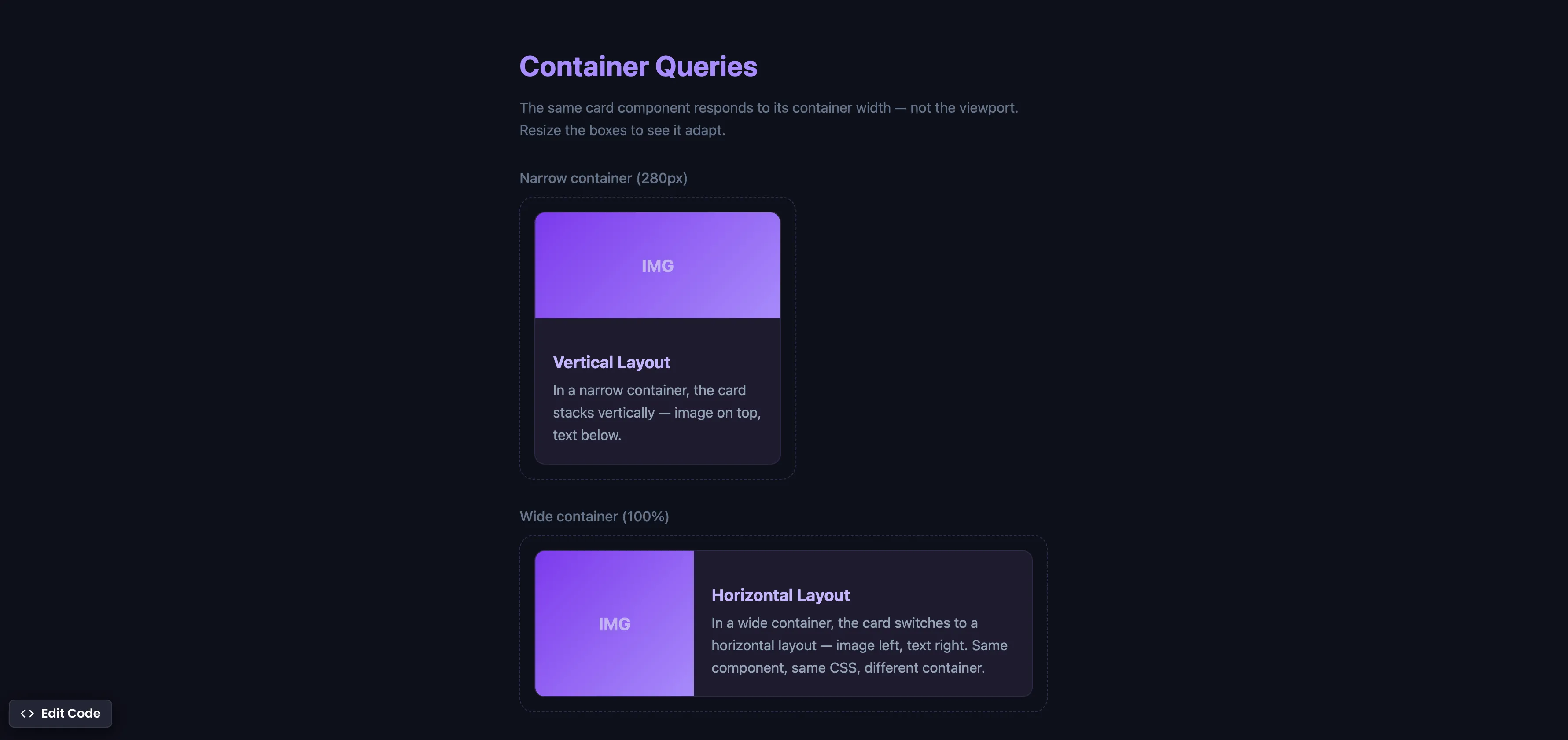
CSS Container Queries
Make components respond to their container width instead of the viewport — true component-level responsive design.
css Intermediate
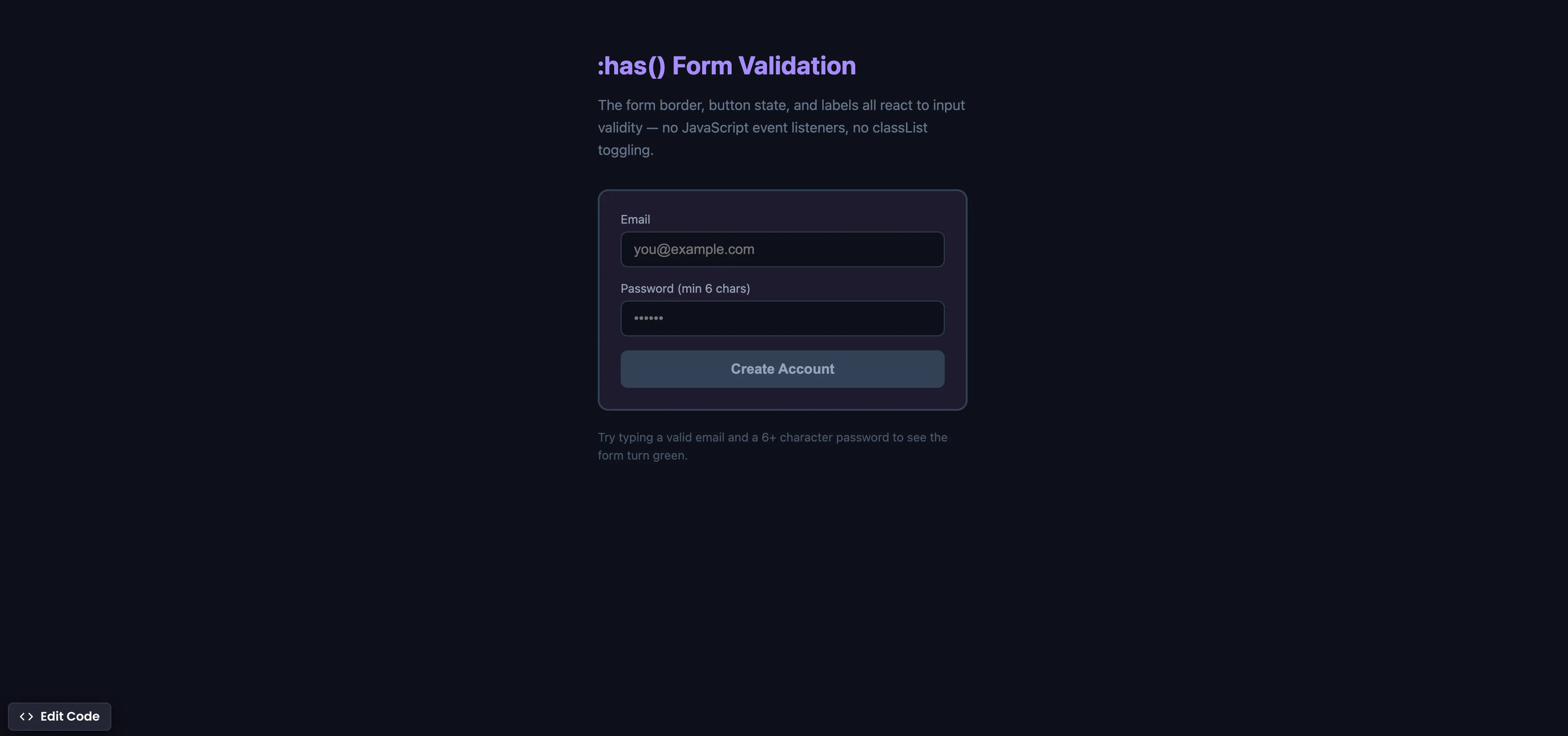
CSS :has() Form Validation
Style forms based on input validity using the :has() parent selector — no JavaScript event listeners needed.