css Intermediate
CSS Container Queries
Interactive editor — edit code and see live results
Open in Editor
How It Works
.card-wrapper {
  container-type: inline-size;
}

.card {
  display: grid;
  grid-template-rows: auto 1fr;
}

@container (min-width: 420px) {
  .card {
    grid-template-columns: 180px 1fr;
    grid-template-rows: none;
  }
}
Summary
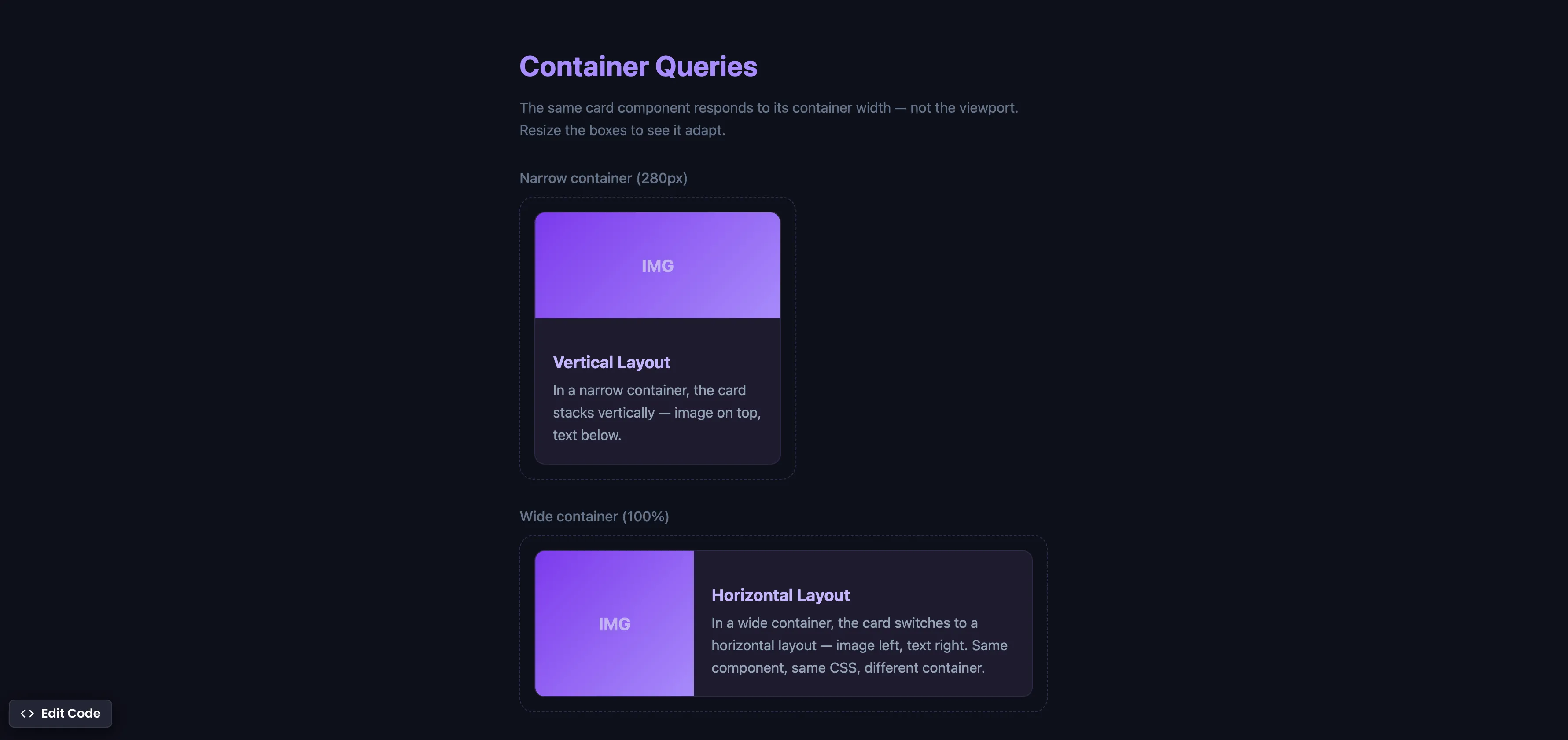
container-type: inline-sizeestablishes a containment context, telling the browser to track the container’s width for query purposes.@containerqueries work like media queries, but instead of checking the viewport width, they check the container’s width.- The same card component automatically switches from a vertical layout (narrow container) to a horizontal layout (wide container) — without any JavaScript.
- This is true component-level responsive design — something that
@mediaqueries, Tailwind, and Bootstrap cannot achieve because they only respond to viewport dimensions. - Supported in Chrome 105+ (Aug 2022), Safari 16+ (Sep 2022), Firefox 110+ (Feb 2023), and Edge 105+. Fully cross-browser.
Try this in our interactive code editor
Practice hands-on with our built-in code sandbox.
Open Code Editor
Adrian Bigaj 

Creator of BigDevSoon
Full-stack developer and educator passionate about helping developers build real-world skills through hands-on projects. Creator of BigDevSoon, a vibe coding platform with 21 projects, 100 coding challenges, 40+ practice problems, and Merlin AI.
Related Pills

css Intermediate
CSS Relative Units
Do you only use pixels or % in CSS? Open yourself to more possibilities and best practices.

css Intermediate
Flexbox equal height cards
Make all cards equal height with flexbox. Especially helpful when content is dynamic.
css Intermediate
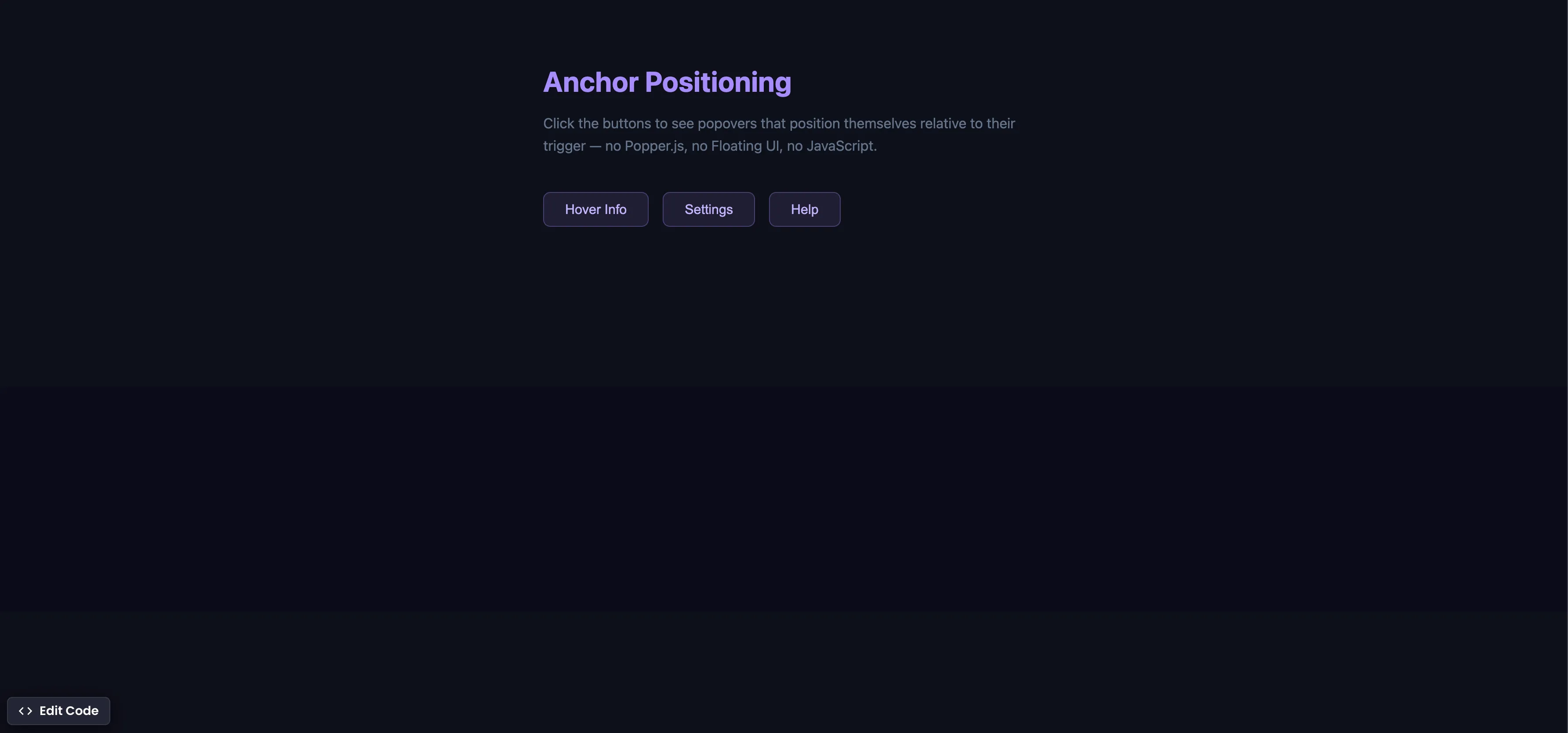
CSS Anchor Positioning
Position popovers relative to any element using CSS anchor positioning — no JavaScript positioning library needed.