CSS Anchor Positioning
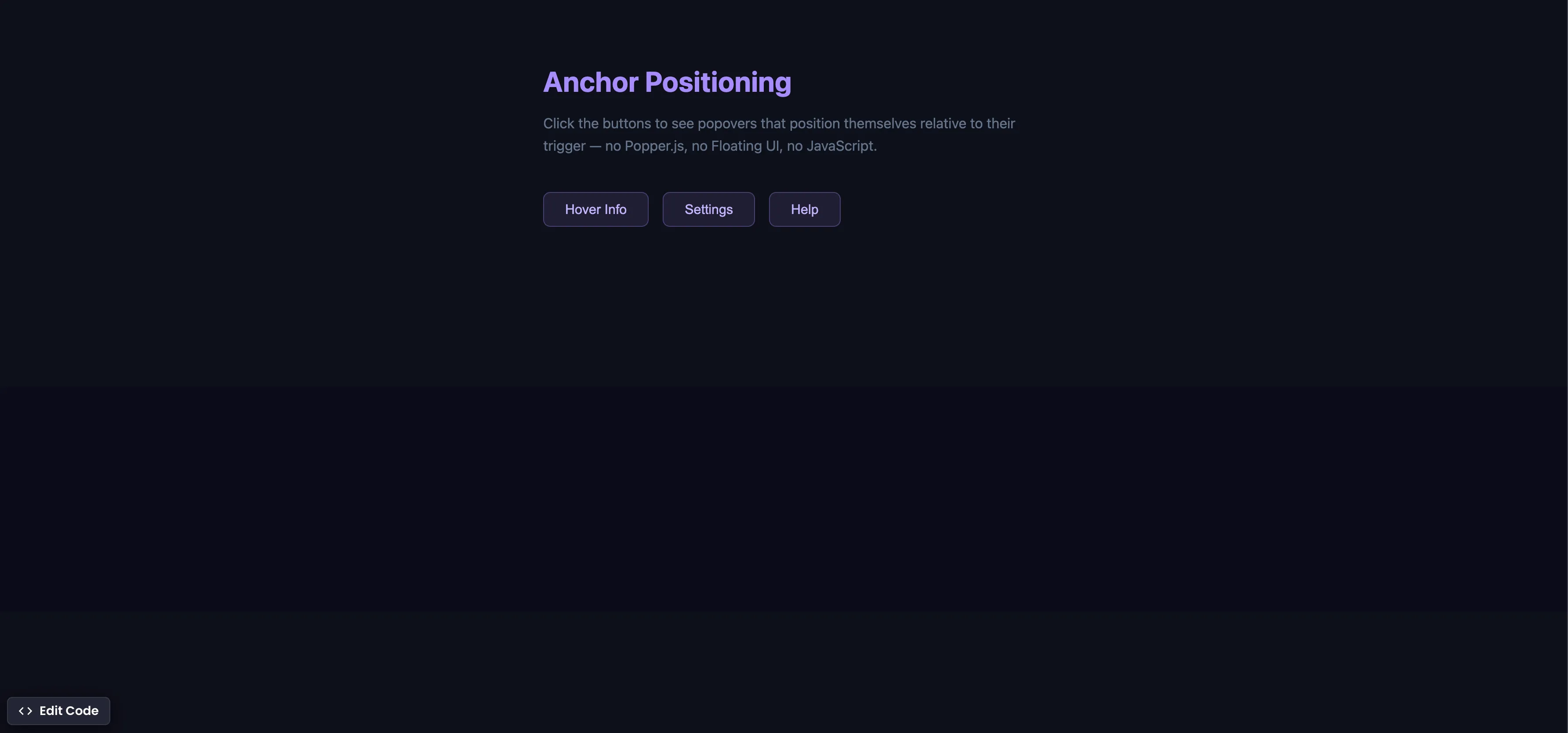
How It Works
Each trigger button gets a unique anchor-name, and each popover references it with position-anchor:
/* Register each trigger as an anchor */
.trigger-1 { anchor-name: --btn1; }
.trigger-2 { anchor-name: --btn2; }
.trigger-3 { anchor-name: --btn3; }

/* Position each popover relative to its trigger */
.popover-1 {
  position-anchor: --btn1;
  top: anchor(bottom);
  left: anchor(left);
  margin-top: 8px;
}
The popover animates in with @starting-style and out with a :not(:popover-open) transition:
.popover {
  opacity: 1;
  transform: translateY(0);
  transition: opacity 0.25s ease, transform 0.25s ease,
    display 0.25s allow-discrete, overlay 0.25s allow-discrete;
}

.popover:not(:popover-open) {
  opacity: 0;
  transform: translateY(-8px);
}

@starting-style {
  .popover:popover-open {
    opacity: 0;
    transform: translateY(-8px);
  }
}
Summary
anchor-nameon the trigger registers it as an anchor point. Each trigger gets a unique name (--btn1,--btn2, etc.).position-anchoron the popover tells it which anchor to attach to.anchor()functions (top: anchor(bottom),left: anchor(left)) place the popover precisely — nogetBoundingClientRect()needed.- Combined with
@starting-style, the popover animates in smoothly fromdisplay: noneand out via:not(:popover-open). - This replaces Popper.js, Floating UI, and 200+ lines of JavaScript positioning logic with a few lines of CSS.
- Supported in Chrome 125+ (May 2024), Edge 125+, and Safari 18+ (Sep 2024). Firefox support is behind a flag.
Try this in our interactive code editor
Practice hands-on with our built-in code sandbox.
Open Code Editor
Creator of BigDevSoon
Full-stack developer and educator passionate about helping developers build real-world skills through hands-on projects. Creator of BigDevSoon, a vibe coding platform with 21 projects, 100 coding challenges, 40+ practice problems, and Merlin AI.
Related Pills

CSS Relative Units
Do you only use pixels or % in CSS? Open yourself to more possibilities and best practices.

Flexbox equal height cards
Make all cards equal height with flexbox. Especially helpful when content is dynamic.
CSS Container Queries
Make components respond to their container width instead of the viewport — true component-level responsive design.