regular
Card 7 of 8
Responsive Web Design
User story
As a user, I want the application to be fully responsive and adapt to different devices, including desktop, tablet, and mobile. The layout should adjust accordingly for optimal usability on each device.
Acceptance criteria
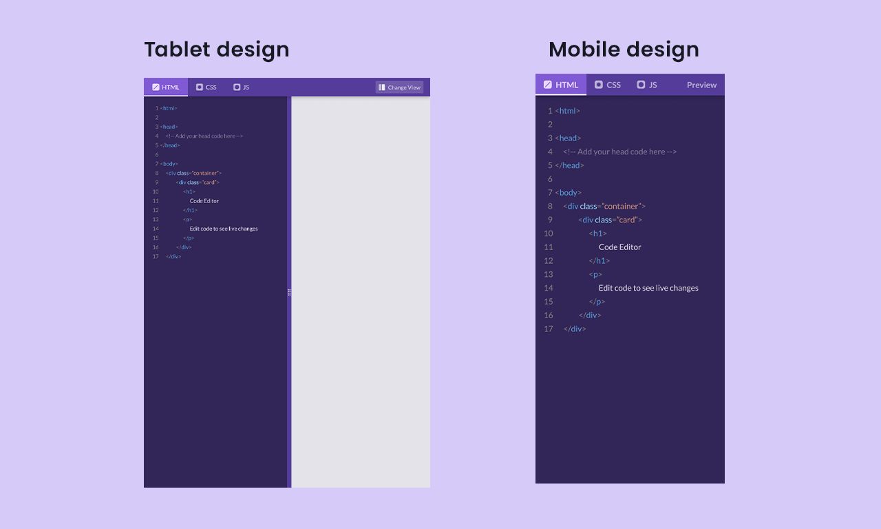
- The application's layout adapts responsively for desktop, tablet, and mobile devices.
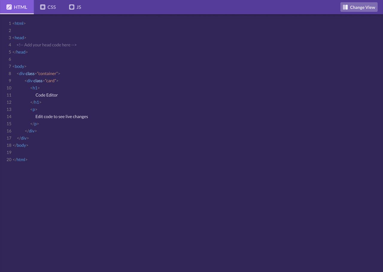
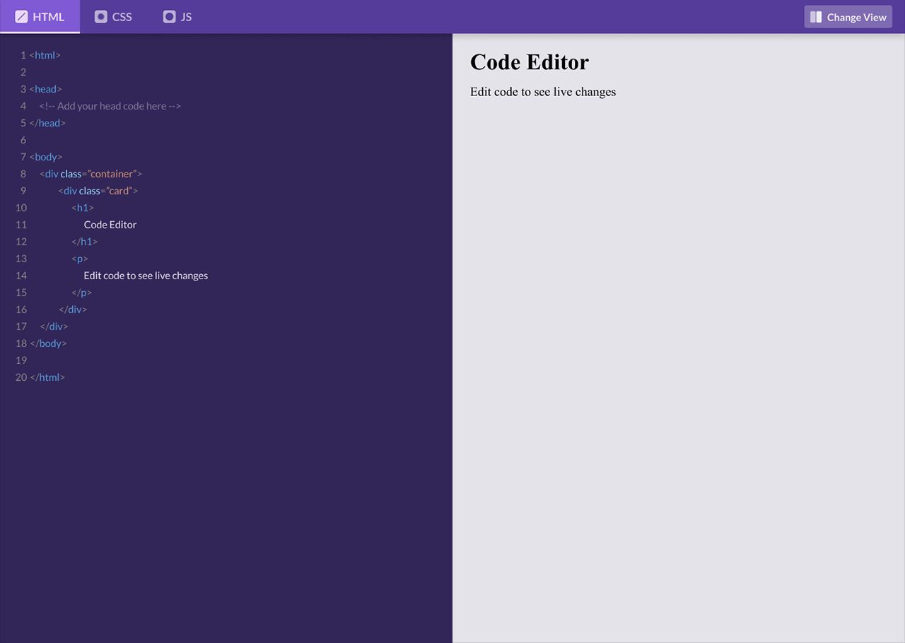
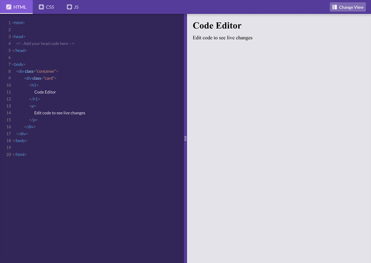
- On the desktop, the code area and preview are displayed side by side.
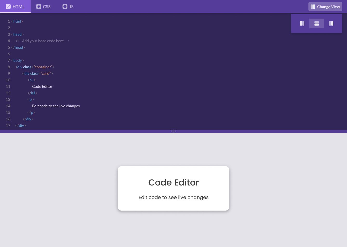
- On the tablet, the layout is similar to the desktop but scaled down proportionally.
- On the mobile, only one tab (e.g., HTML or Preview) is visible at a time, and the layout is optimized for vertical scrolling.
Build this task card
Start your 7-day free trial to build this card in our code editor with Figma designs and live preview.
Start 7-Day Free Trial to Build This Card