Day 87 Advanced
Challenge 87 of 100
Charts
As a user, I want to visualize my data using various types of charts and graphs, so that I can easily interpret and understand the information.
Acceptance Criteria
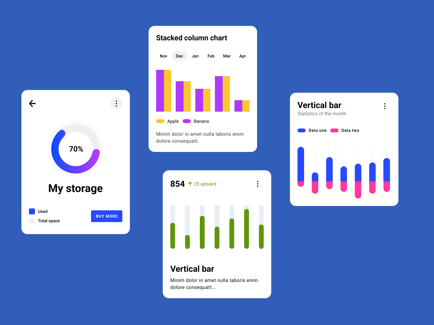
- ✓ Display a donut chart representing storage usage, indicating both used and total space, with an option to buy more storage if needed.
- ✓ Provide a stacked column chart that compares data (e.g., Apple and Banana) across different months, with a clear legend and labels.
- ✓ Include a vertical bar chart that shows monthly statistics for two different data sets, with distinct colors for easy differentiation.
- ✓ Ensure that all charts are interactive and update dynamically when new data is available.
- ✓ Charts should be responsive, maintaining readability and usability across different screen sizes and devices.
100 Days of Code Progress Day 87 / 100
Take this challenge
Start your 7-day free trial to solve this challenge in our built-in code editor with live preview.
Start 7-Day Free Trial to Solve This Challenge